

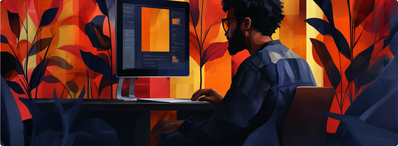
In today’s digital world, your website is your brand’s opening act—and we all know how important first impressions can be! If your site looks outdated or hard to navigate, it’s basically showing up in sweatpants to a black-tie event.
If this rings true for you, then it’s time for a new digital wardrobe.
But hey, don’t worry, join us as we dive code-first into why your website should be the bee’s knees, and some of the biggest website dos and don’ts so you can hook visitors from their very first click.
Think of your website as the front door to your business. It’s open 24/7, ready to greet visitors while you’re off binge-watching your favourite series. If it’s not pulling its weight, you’re leaving money on the table.
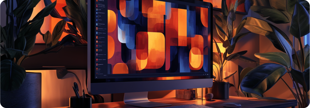
Don’t confuse minimalism with being boring. A clean, straightforward design helps visitors find what they’re looking for fast. You want your visitors to think, “Wow, that was easy,” not, “Where’s the exit?”.
Let’s be real, most people are scrolling on their phones while waiting in line for their coffee order. Hardly anyone sits at their desktop for their daily internet fix. For this reason, your website must look good on mobile, or you’ll miss out on a huge chunk of traffic.
If people can’t find what they need within a few clicks, they’re out. Make it intuitive. Think: if a 56-year-old can navigate it, you’re on the right track.
The words on your site need to speak to your audience, not at them. Be clear, concise, and for the love of all things digital, be interesting. If your copy sounds like an instruction manual, no one’s sticking around.
A/B testing isn’t just for the data nerds. Trying different layouts, calls to actions, or images can give you insight into what’s actually working. Trust the numbers, not just your gut.
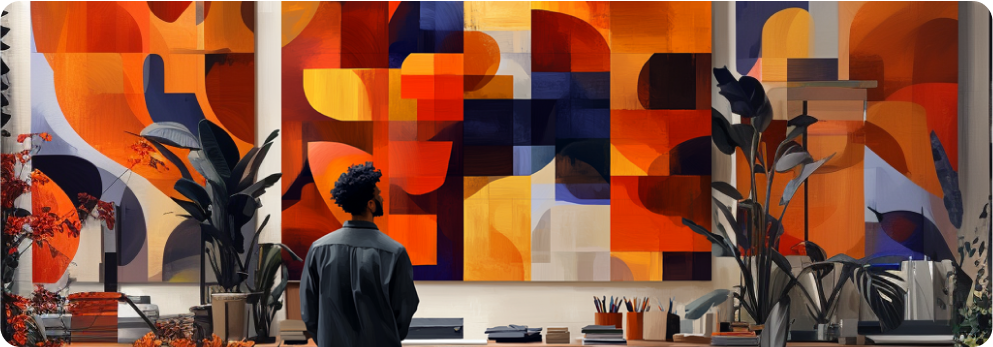
You know those sites that are so flashy you can’t even focus? Yeah, don’t be that guy. Parallax scrolling, animations, and pop-ups can add value—but only if they don’t overwhelm your visitors.
If your website takes forever to load, visitors will leave before they even see your snazzy homepage. Optimise your images and keep things running smoothly. Fast websites for the win!
You can have the most beautiful site in the world, but if it’s buried on page 27 of Google, does it even exist? SEO matters. Make sure your site is optimised so people can actually find you.
If people have to search through endless menus or scroll for days to find your contact info, that ‘Exit Page’ button will start beckoning. Keep it clear, keep it easy.
You know the ones—perfectly posed people in ultra-white offices that no one’s ever seen in real life. They’re cheesy and fake. Opt for authentic images or custom illustrations that feel more like you.
Sure, a good-looking website is a nice start, but it takes more than just eye candy to make a website work.
Here’s the secret sauce:
Your website is often the first impression potential customers have of your business, so make it count!
Keep things simple, engaging, functional, fast and updated. This way, you’ll have a digital space that’s more than just a pretty face, it’ll be a revenue-generating machine.
Most importantly, keep it uniquely you.
Do you have a question, idea, or project that requires assistance? Reach out to us or connect with us through our social media channels.

Loading, please wait...

Give with confidence. Our secure payment system ensures your personal details are kept safe and secure.